Interactive Data Dashboard
Python, Flask, MongoDB, DC.js, Crossfilter, Bootstrap 3, JavaScript

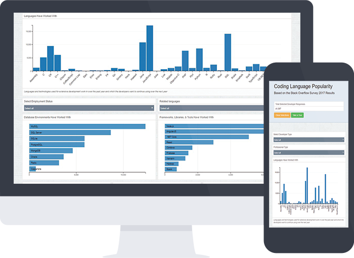
This project is a dashboard for interactive data visualization that represents coding languages popularity among over 51,000 Stack Overflow’s 2017 Developer Survey respondants. The dashboard visualizes data in bar, row, and pie charts, as well as provides select menus to filter the data. The graphs are interactive and react to user selections.
The app uses D3.js and DC.js to renders charts from a large MongoDB database and uses Crossfilter.js to allow exploration of the datasets for analysis. The charts are styled with Dc.css and then bootstrap is used in conjuction with keen.js & keen-dashboards.css to layout the dashboard elements.
Flask is used for building the server that interacts with MongoDB and renders the HMTL page that contains the charts.
The data used is a set of responses from Stack Overflow’s 2017 Annual Developer Survey. The original Data set is available in .csv format only and needed to be imported into MongoDB.
View the source code on: Github
View portfolio for more samples of my work or contact me if you're interested in working together.